Since its release in early access in 2021, Valheim has evolved significantly in the depth of its biomes, adventures, crafting and combat system. Even with their recent 1.0 release however (September 2026), little has improved in the UX of its core in-game menus and interfaces. As a personal exercise, I wanted to see how I’d further develop these to improve the player experience with better usability and a more immersive visual style.
Role: As a personal project, I was responsible for all components of the redesign and its process. That said, icons were sourced from flaticon, textures from pexels, and game assets and screenshots are directly from Valheim.
To start, I pulled examples of the HUD states and in-game menus, then highlighted key areas of friction or confusion that impacted usability. Valheim’s current UX/UI serves the gameplay well, but there’s definitely room to better support players' understanding of and ability to play the game.
Current areas of success:
1. Simple UI doesn’t distract or obscure gameplay
2. Consistent menu locations build mental models
3. Contextual affordances make interactions easier
Areas for improvement:
1. Limited hotbar functionality makes managing equipment challenging
2. TAB menu packs in too many things (inventory, basic crafting, trophies, stats)
3. Crafting system and menus can’t be easily accessed in a single place
4. Limited information hierarchy impacts readability
5. Simple UI feels unpolished and contributes little to worldbuilding
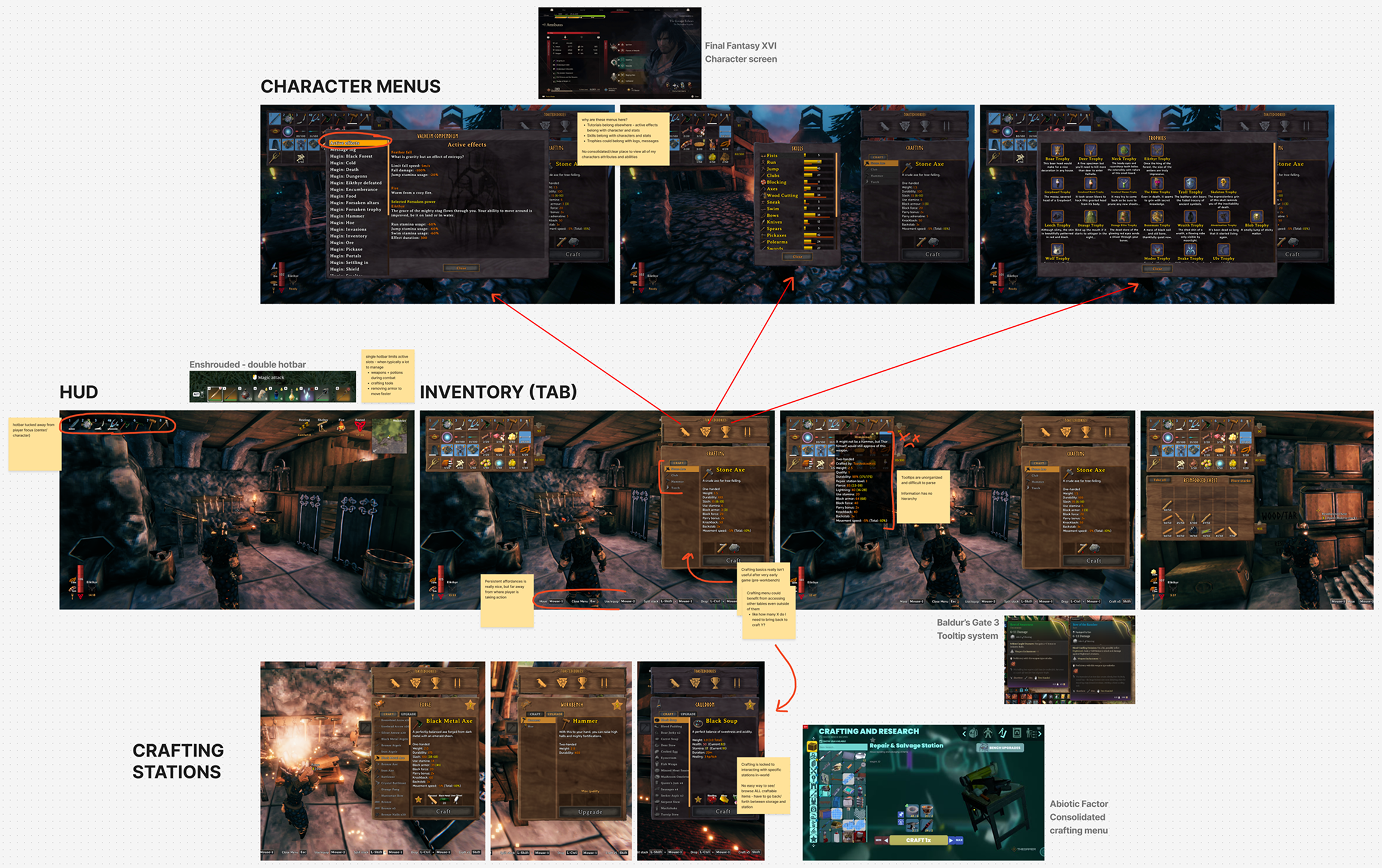
My intentions with the redesign were to improve on the HUD and in-game menus to make interactions easier, more legible, and more organized, as well as refine the visual style to compliment the game’s setting and lore.
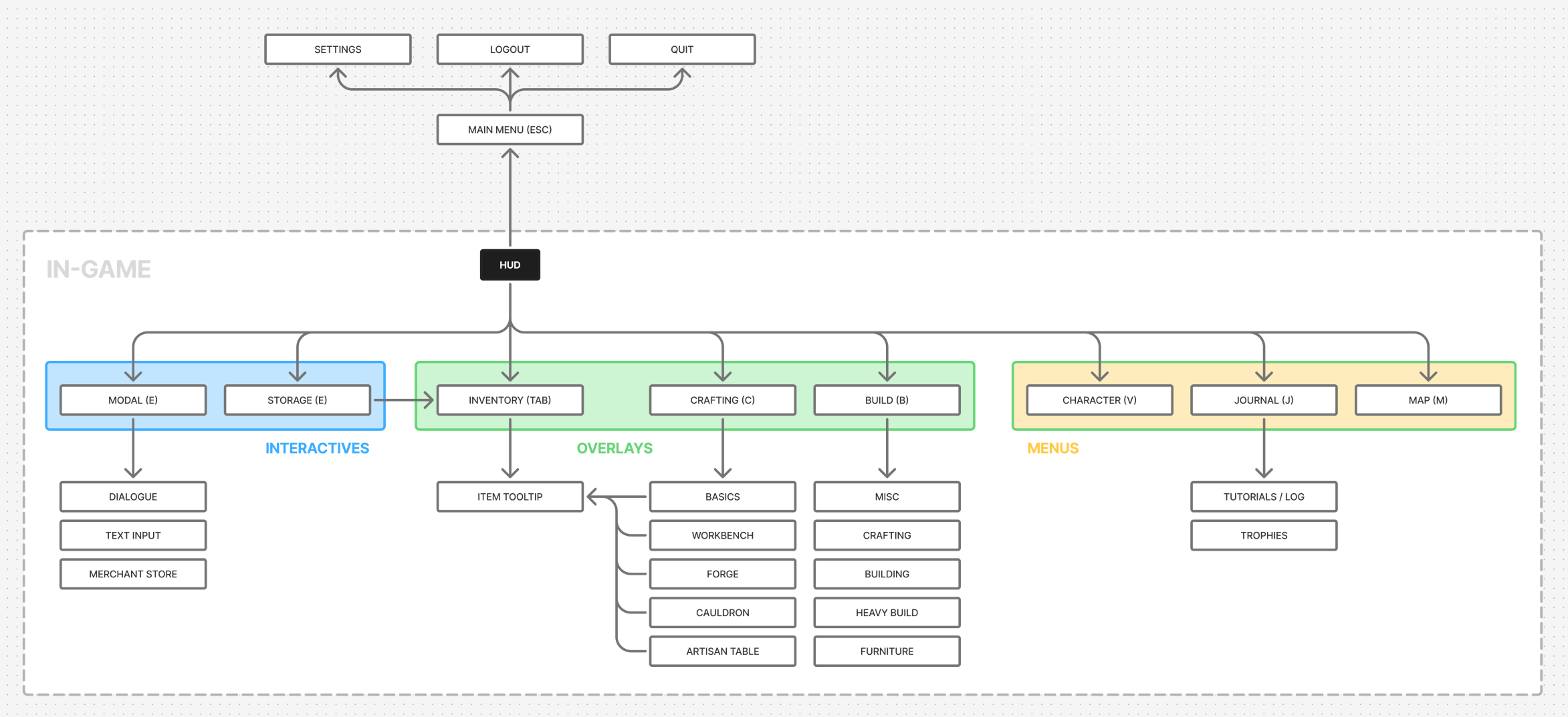
As a necessary foundation for any improvements, I first built an understanding of the current system of in-game UI components as a flow map. Then rebuilt that map in a way that better organized the system. From there I could ideate solutions through sketching, and start to refine my best ideas through wireframes and prototypes.
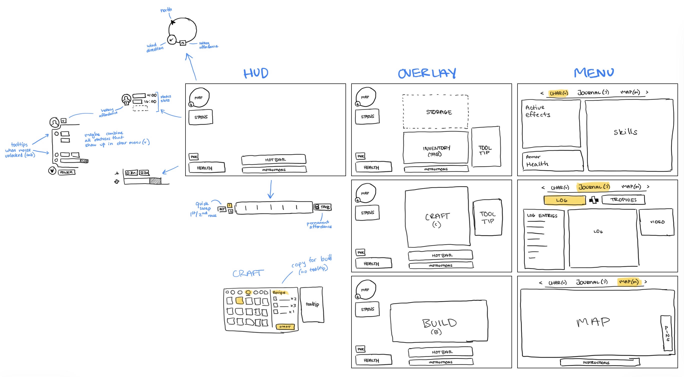
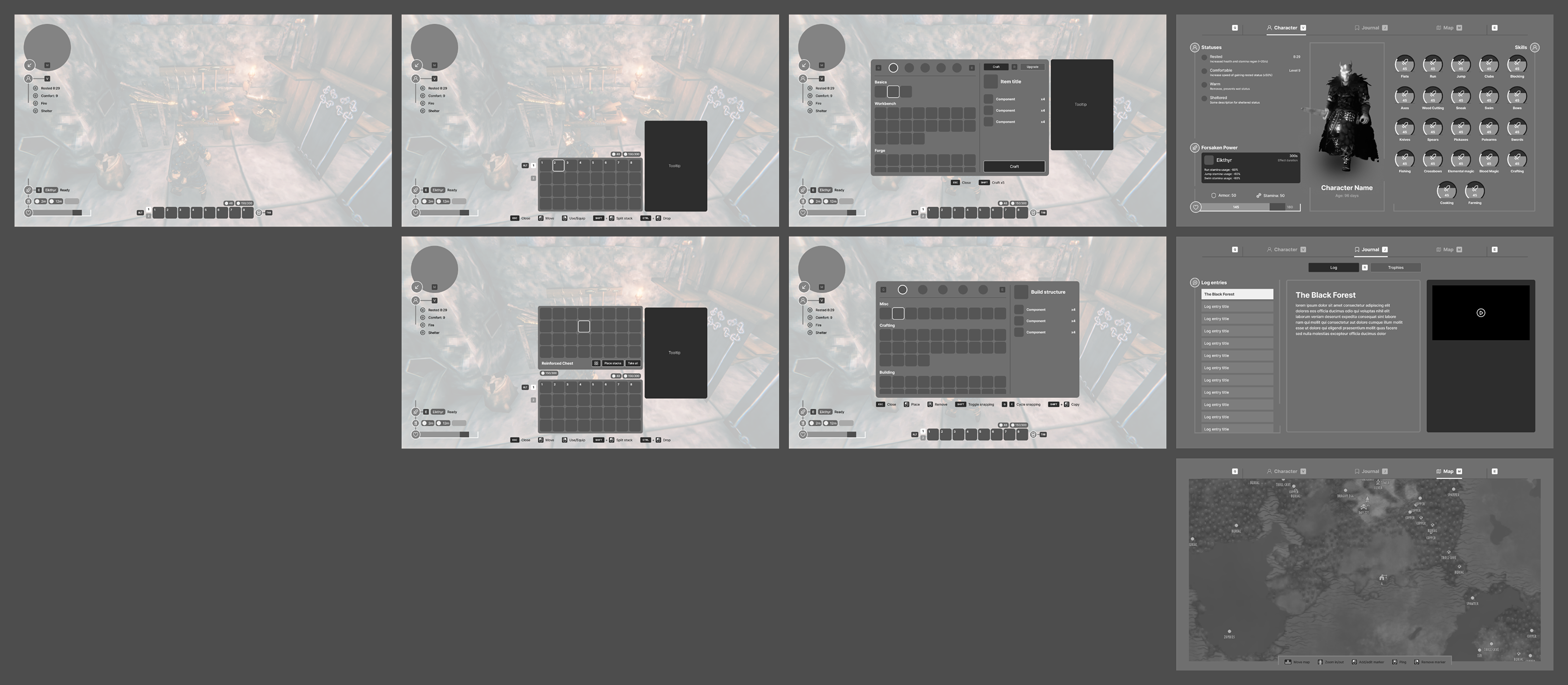
Some more complicated interactions needed to be prototyped to validate usability and their effectiveness. A key example was the updated hotbar, which now included two states that a user could quickly swap between, and dynamically transitioned from the HUD to a full inventory view.
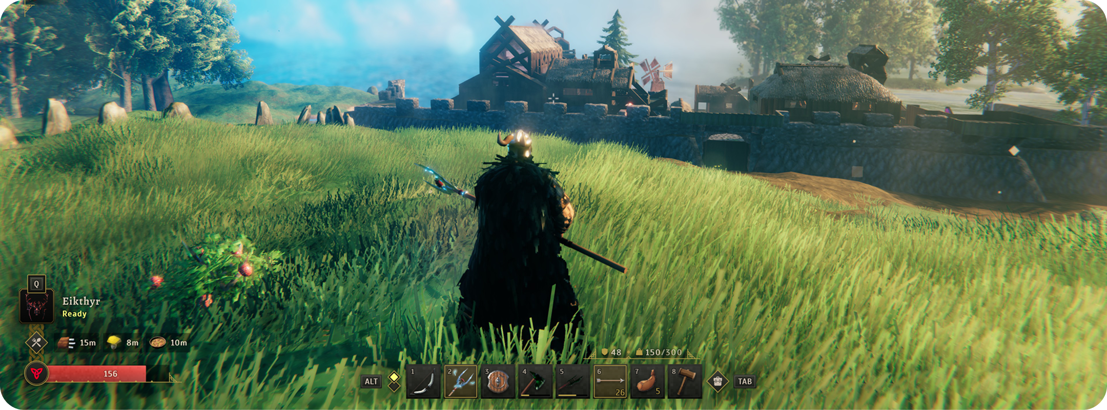
The final redesign ended up being an overhaul of the entire in-game UI, and introduced improvements for all the areas I highlighted above. The main updates are:
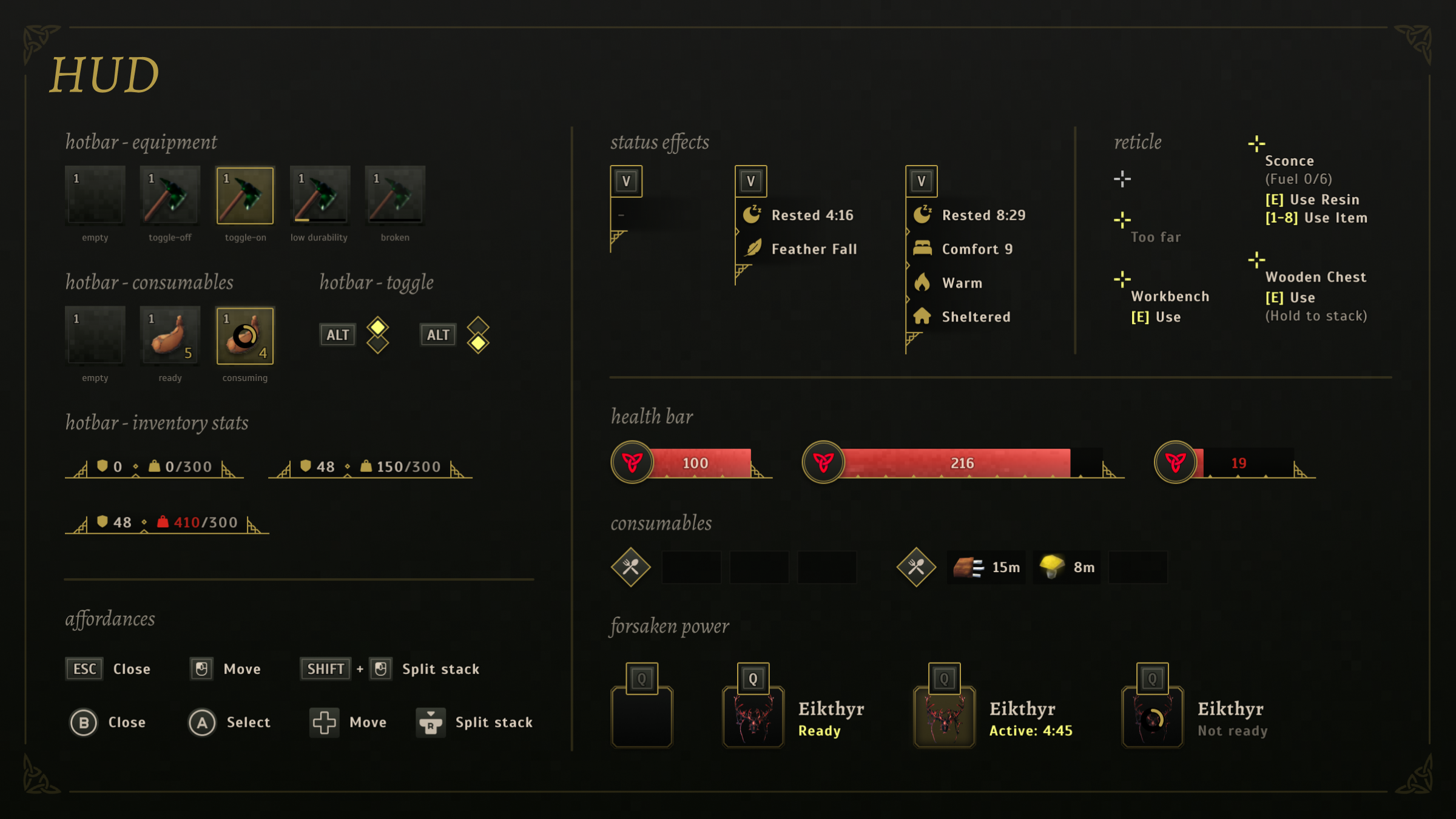
1) New hotbar which makes more items easily accessible
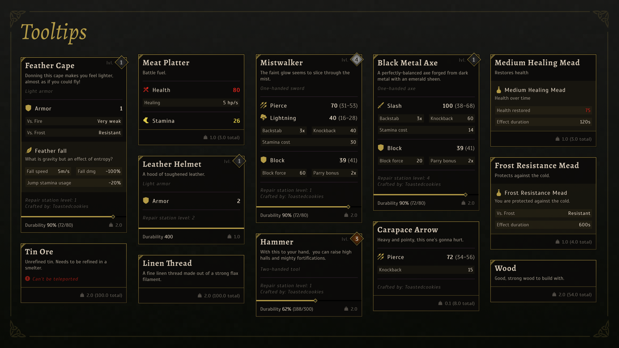
2) Improved item tooltip system
3) Consolidated crafting menu
4) Dedicated character screen for statuses and skills.
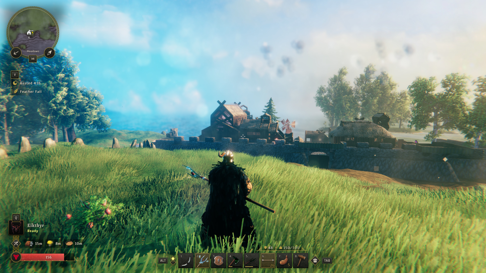
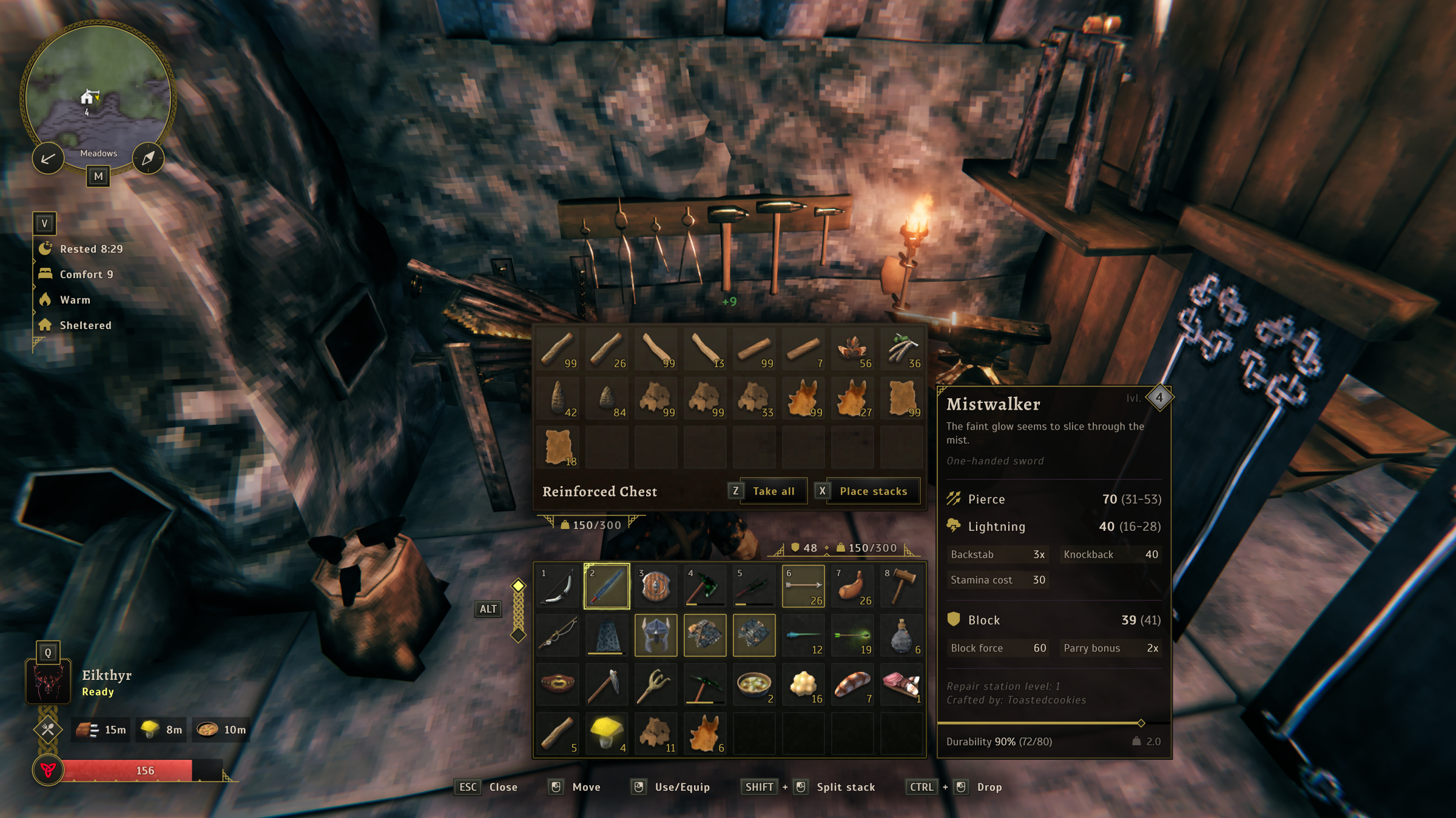
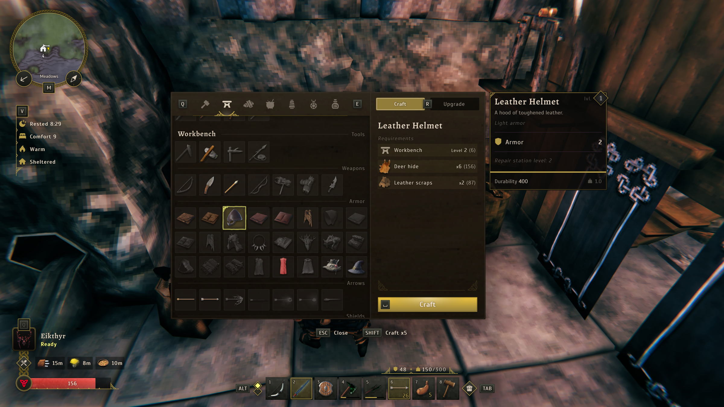
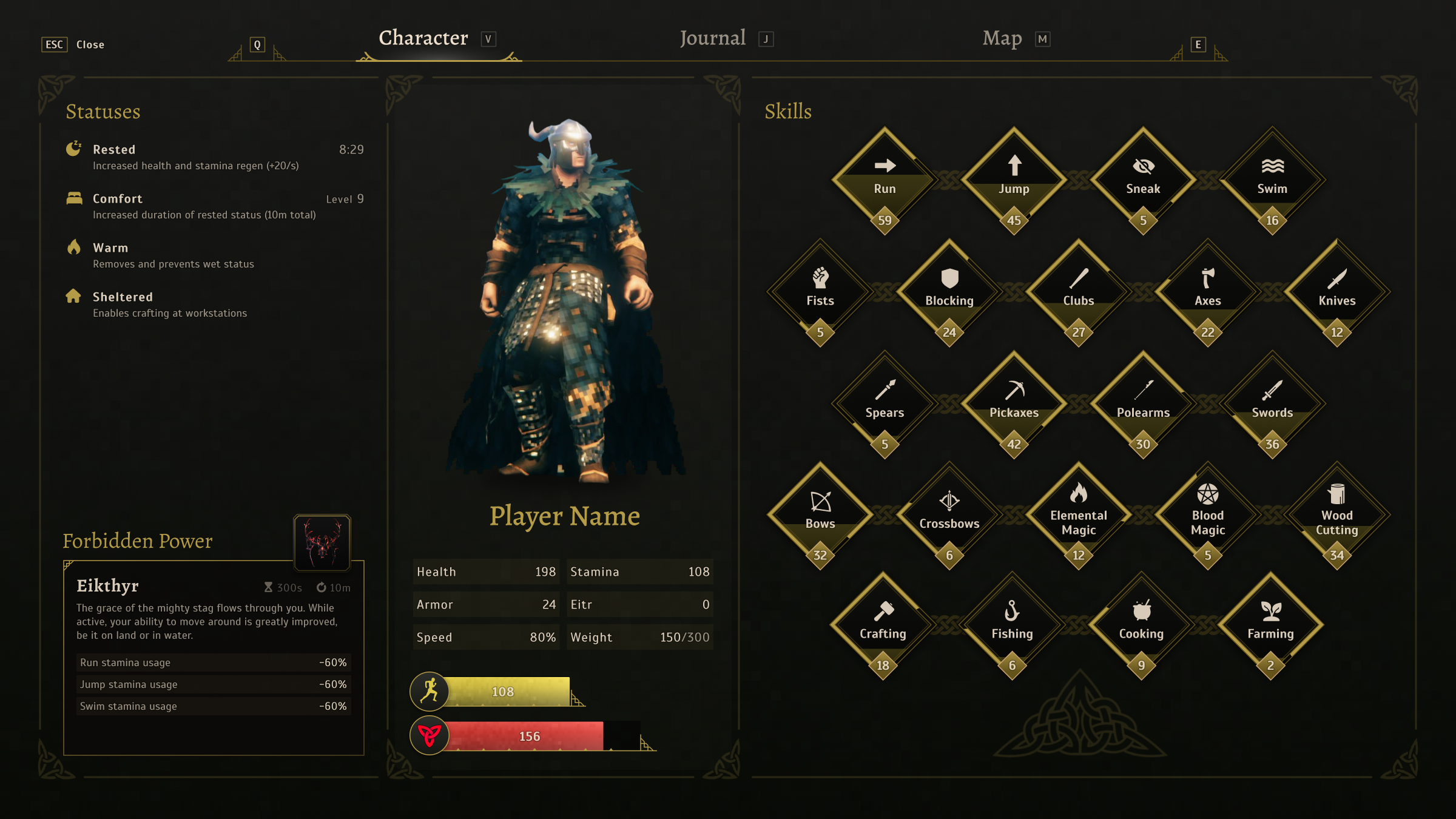
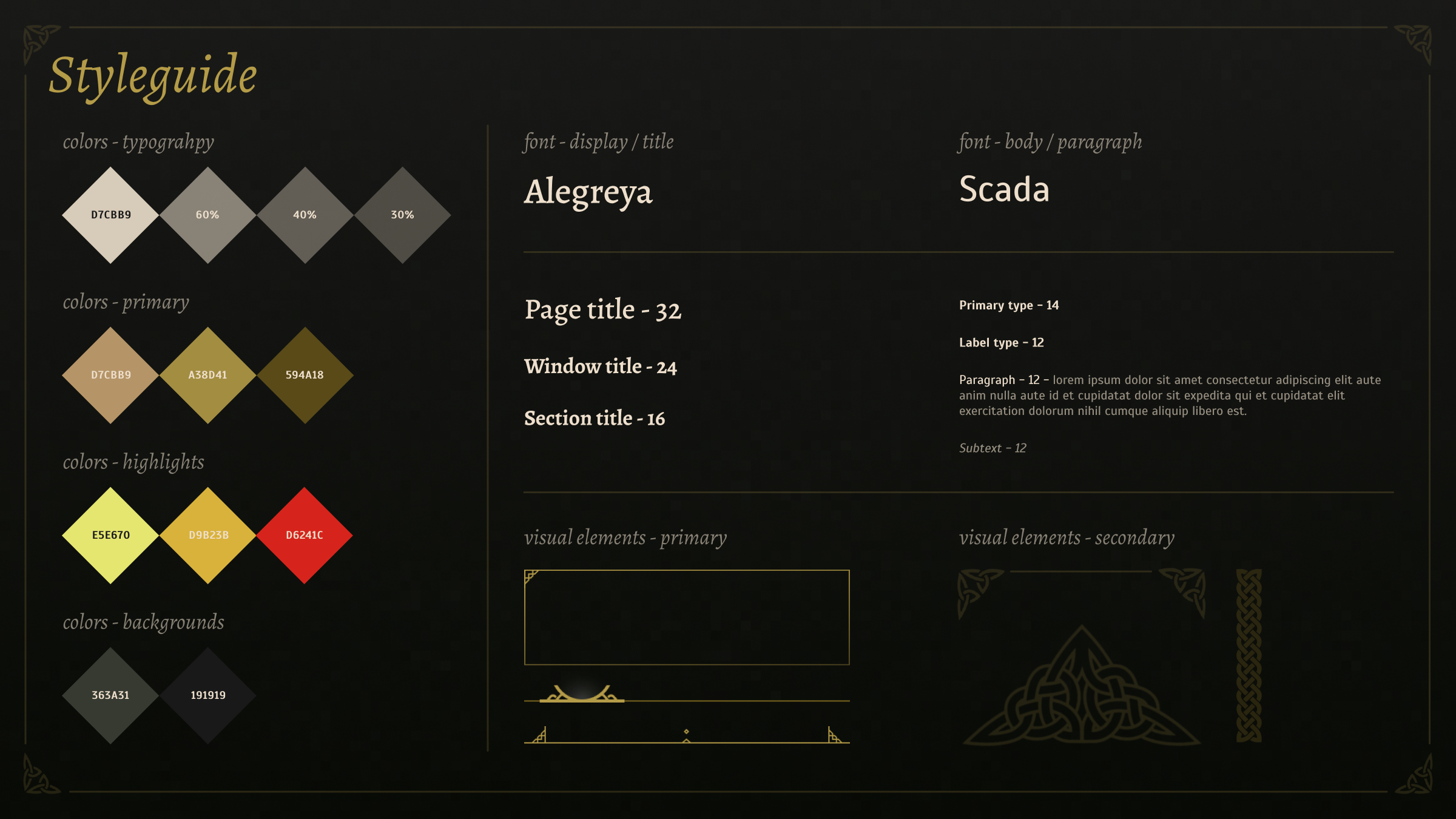
In building out the redesign, I created a styleguide and design system to ensure consistency and a unified appearance of the UI. This included Figma variables and components which could be easily reused and adapted.